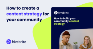
When someone lands on your community homepage, they’re already making decisions before they even read a word. Here’s how to make sure those first impressions count.
Whether we realize it or not, we all make snap judgments about digital spaces within seconds of arriving. For community managers, this reality makes design more than just aesthetics—it becomes a strategic tool for building trust, reducing friction, and creating belonging. When members feel overwhelmed or confused by your community’s visual presentation, engagement suffers before it even begins.
This challenge led Hivebrite to develop one of the most powerful page builders on the market, specifically designed for community platforms. During a recent webinar, our design and product teams demonstrated how strategic visual design can transform member experiences and drive meaningful connections.
The psychology of first impressions
“Your design is your first impression,” explains Meghan Bates, Senior Community Strategist at Hivebrite. “It’s going to set the tone, build trust, or create friction.”
Research consistently shows that users form opinions about websites within 50 milliseconds of viewing them. For communities, this means your homepage design directly impacts whether new members decide to engage or bounce immediately.
The most successful community designs focus on five key elements:
Clear Navigation: Reducing cognitive load by highlighting your three most important member actions prominently in navigation menus.
Purposeful Page Titles: Helping visitors understand your community’s value proposition immediately upon arrival.
Strategic Calls to Action: Guiding members toward 2-3 specific engagement activities without overwhelming them with choices.
Social Proof Elements: Using badges, testimonials, and member stories to signal that your community is active and valuable.
Human Connection: Incorporating member stories, photos, and logos that create credibility and emotional connection.
Beyond basic templates: The power of no-code design
Traditional website builders often force community managers into rigid templates that don’t reflect their unique brand or member needs. Hivebrite’s page builder takes a different approach, offering a drag-and-drop editor specifically built for community platforms.
Marie Duvillier, Lead Product Manager at Hivebrite, walked webinar attendees through the platform’s core capabilities. “The page builder allows you to create unique pages for your community web pages and really customize the experience for different members,” she explains. “Those pages can be public, private, inside groups, or restricted to different types of users.”
Three levels of customization
The page builder operates on three distinct levels, each serving different user needs and technical comfort levels:
Single components: Basic building blocks including headlines, paragraphs, buttons, images, and custom code options. These elements automatically pull from your community’s existing branding, ensuring visual consistency without manual color matching.
Pre-Built blocks: Full-width components like hero sections, partner logos, and image galleries that are mobile-responsive by default. Each category offers multiple layout options—for example, partner logo blocks come in four different arrangements.
Advanced components: Dynamic elements that automatically pull fresh content from your community modules. These include upcoming events, recent forum discussions, news updates, and member spotlights that update in real-time without manual intervention.
Creative design techniques that drive engagement
While basic page building serves many community needs, strategic design choices can elevate member experiences significantly. Magali Rivière, Visual Designer at Hivebrite, demonstrated advanced techniques that transform standard pages into engaging visual experiences.
Background images as design tools
One of the most impactful techniques involves using custom background images to create visual flow and section divisions. Rather than relying solely on color blocks, strategic background images can:
- Create smooth transitions between different page sections
- Guide users’ eyes through content in a logical sequence
- Establish visual hierarchy without overwhelming design elements
- Maintain mobile responsiveness across different screen sizes
“What’s important with background images is positioning them correctly,” Rivière explains. “If you want people to see a specific design element, position it appropriately—bottom for wavy transitions, center for split-color sections.”
Dynamic visual elements
The platform also supports subtle animations and video backgrounds for communities wanting to create more immersive experiences. These elements work particularly well for:
- Welcome pages that need to make strong first impressions
- Event landing pages promoting major community gatherings
- Member onboarding sequences that guide new users through key features
Modular component customization
Even pre-built components offer extensive customization options. Strip components, for example, can display 2-4 cards with customizable frame colors, and administrators can choose which elements to show or hide—images, headlines, subtitles, or buttons.
This flexibility allows community managers to create dramatically different visual experiences using the same underlying component structure.
Advanced features for sophisticated communities
Personalized dynamic content
Advanced components go beyond static information to create personalized member experiences. The platform can automatically display:
- Suggested Groups: Customized recommendations based on member profiles and interests
- Recent activity: Forum discussions, news updates, or events filtered by categories
- Profile integration: Welcome messages with completion rates and personalized calls to action
Mobile-first design considerations
With many community members accessing platforms primarily through mobile devices, the page builder includes dedicated mobile editing capabilities. Currently focused on text and title optimization, the mobile editor allows administrators to adjust font sizes and spacing specifically for smaller screens.
“The mobile mode solves the main pain point where big headlines would break awkwardly on mobile devices,” Duvillier explains. Future updates will expand mobile customization options to include image sizing, content reordering, and selective content hiding for streamlined mobile experiences.
Content filtering and categorization
For communities with extensive content libraries, advanced components can filter and display specific content types. Forum discussions can be filtered by category, news updates can be segmented by topic, and events can be sorted by relevance or date.
This capability proves particularly valuable for large communities where members need help discovering relevant content without feeling overwhelmed by volume.
Real-world implementation strategies
Starting simple, building complex
Community managers new to page building should begin with basic components and gradually incorporate more sophisticated elements. Marie Duvillier recommends this progression:
- Foundation phase: Use single components (headlines, paragraphs, buttons) to create clean, functional pages
- Enhancement phase: Add pre-built blocks for visual interest and professional polish
- Advanced phase: Implement dynamic components and custom backgrounds for unique experiences
Template strategy for scale
The platform allows administrators to create custom templates that can be reused across multiple pages or shared with group administrators. This approach ensures:
- Consistent branding across all community pages
- Faster page creation for routine needs
- Standardized layouts that reduce decision fatigue
- Easy delegation of page creation to volunteer moderators
Testing and optimization
Successful page design requires ongoing testing and refinement. Key areas to monitor include:
- Mobile responsiveness: Regular testing across different device sizes and orientations
- Loading performance: Ensuring background images and videos don’t slow page load times
- User behavior: Tracking which page elements drive the most engagement
- Accessibility: Verifying that design choices don’t create barriers for users with disabilities
Common challenges and solutions
Resource constraints
Many communities operate with limited design resources. The page builder addresses this through:
- Pre-built templates that provide professional starting points
- Automatic branding integration that maintains consistency without design expertise
- Modular components that can be mixed and matched without custom development
- Real-time preview that allows testing before publishing
Technical complexity
While the platform offers sophisticated capabilities, it maintains accessibility for non-technical users through:
- Drag-and-drop interface that requires no coding knowledge
- Visual editing with immediate feedback
- Progressive complexity that allows users to start simple and add features over time
- Built-in mobile optimization that handles responsive design automatically
Content management
Dynamic content components address the ongoing challenge of keeping community pages fresh and relevant without constant manual updates. Once configured, these elements automatically pull new content as it becomes available in various community modules.
The future of community design
As community platforms evolve, visual design becomes increasingly important for member retention and engagement. The most successful communities will be those that can create personalized, visually compelling experiences without requiring extensive technical resources.
Hivebrite’s page builder represents a significant step toward democratizing sophisticated community design. By providing powerful tools within an accessible interface, it enables community managers to create professional, engaging experiences that reflect their unique brand and member needs.
The platform continues to evolve based on user feedback, with upcoming features including:
- Enhanced mobile editing capabilities for complete responsive design control
- Additional template options including FAQ pages and leaderboards
- Expanded customization options for existing components
- Improved content filtering and personalization features
Getting started: Practical next steps
For community managers ready to elevate their visual design, consider these immediate actions:
- Audit current pages: Identify which pages create friction or fail to engage members effectively
- Define priority actions: Determine the three most important things you want members to do in your community
- Start with templates: Use existing templates as starting points rather than building from scratch
- Test mobile experience: Ensure all pages work effectively on mobile devices
- Gather member feedback: Ask your community what visual elements help or hinder their experience
The goal isn’t to create the most visually complex pages possible, but rather to design experiences that remove friction and encourage meaningful member engagement. As Meghan Bates concludes, “Every element should play a role in building trust and creating belonging.”
Ready to transform your community’s visual experience? Hivebrite’s page builder offers the tools and flexibility to create engaging, professional community pages without requiring design expertise. Learn more about design services and page builder best practices by scheduling a demo or contacting your customer success representative.


